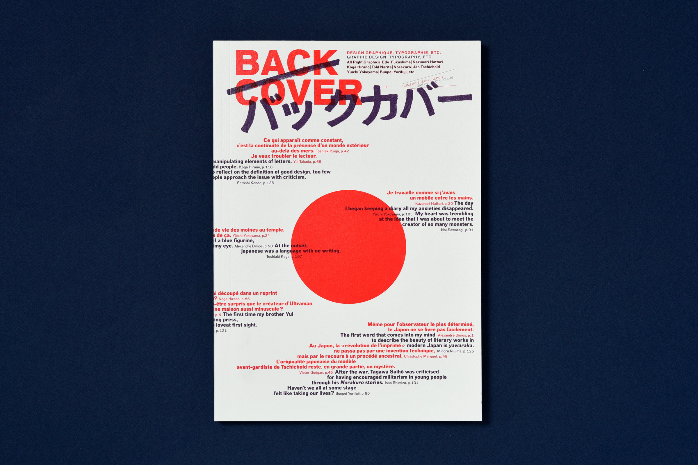
SOMMAIRE
Tentative d’approche (reportage)
par Alexandre Dimos
Profitant d’un séjour de quatre mois à Kyoto dans le cadre d’une résidence à la Villa Kujoyama, Alexandre Dimos a tenté de saisir les différentes façons de pratiquer le design graphique au Japon et de comprendre la place des graphistes au sein de la société japonaise. Cette enquête se déroule également sur trois entretiens : « Les transformations de Bunpei Yorifuji », « Équilibre et gâteaux volants : le design de Kazunari Hattori », « Do you speak Japanese ? All Right Graphics ou les multiples facettes du clan Takada » (écrit avec Jennifer Hasae).
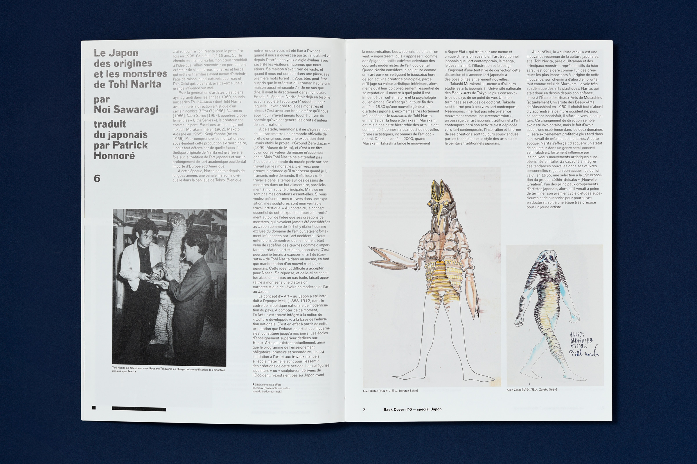
Le Japon des origines et les monstres de Tohl Narita
par Noi Sawaragi
Dans les années 1960, Tohl Narita a participé à la création de dizaines de monstres et de personnages pour les séries télévisées Ultra Q et Ultraman. Son travail est profondément ancré dans l’histoire de l’art et se situe aux croisements des cultures savante et populaire. Les monstres « Dada », « Buruton » et « Garamon » convoquaient ainsi des figures de l’histoire de l’art française sur les écrans des jeunes japonais. Erratum : Malgré toute notre vigilance une erreur s’est glissée, à plusieurs reprises, dans cet article. Il faut bien évidemment lire le nom masculin « monstre » à la place de « montre ». Veuillez nous excuser pour cette confusion malencontreuse.
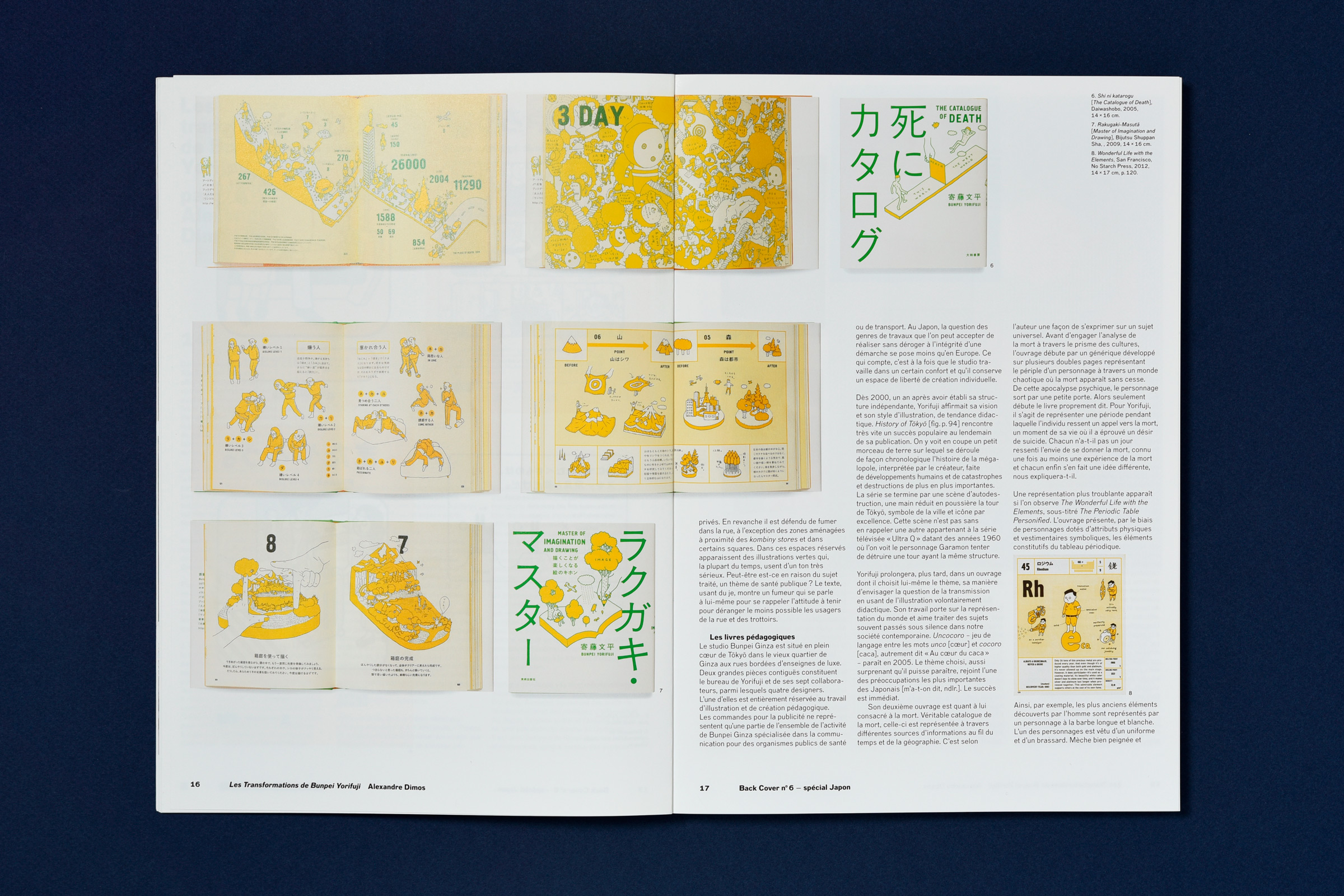
Les transformations de Bunpei Yorifuji
par Alexandre Dimos
Équilibre et gateaux volants : le design de Kazunari Hattori
par Alexandre Dimos
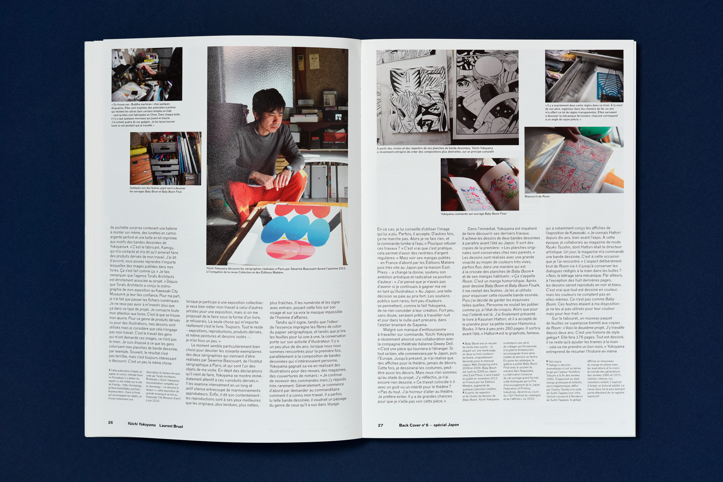
Yuichi Yokoyama. L’atelier de Sayama
par Laurent Bruel
Auteur prolifique au coup de crayon bien aiguisé, Yūichi Yokoyama imagine ses histoires dans des décors géométriques aux personnages sans cesse en mouvement. Yokoyama ne transige pas avec sa pratique artistique. Laurent Bruel, éditeur français de ses ouvrages, nous livre un reportage à travers lequel nous nous rapprochons de la sensibilité et de l’exigence de Yokoyama.
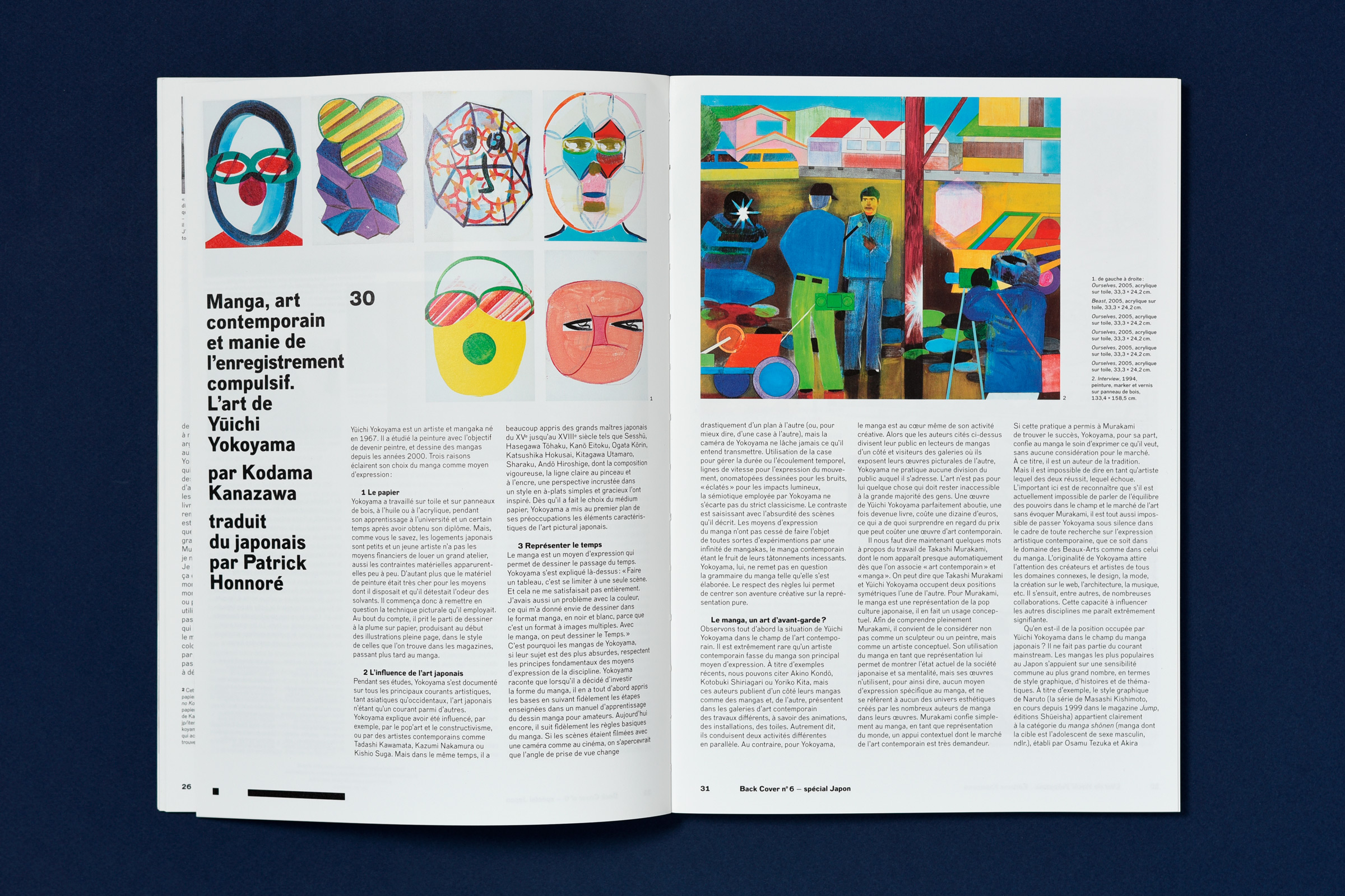
Manga, art contemporain et manie de l’enregistrement compulsif. L’art de Yūichi Yokoyama
par Kodama Kanazawa
Regard japonais sur l’œuvre de Yokoyama.
Fukushima Daiichi. Présentation et re-présentation de la catastrophe.
par Anne-Lyse Renon
La catastrophe de Fukushima en mars 2011 n’est pas un monde nouveau dans la représentation de la catastrophe nucléaire. Mais parce qu’il y a des moyens nouveaux de la représenter qui n’existaient pas par le passé, et de plus avec d’autres temporalités, l’on peut en recenser de multiples formes de visionnage. Comment s’effectuent l’expression, l’interprétation et la transmission par et avec les images d’un tel évènement ? Quelle est la place du design (graphique) dans un tel mécanisme de lecture ?
La Japonité dans la typographie
par Toshiaki Koga
La composition typographique moderne s’est développée au Japon au début du XXe siècle. Cet essor correspond au moment où le pays a été propulsé vers une occidentalisation voulue par le pouvoir politique. La langue japonaise nécessite des milliers de caractères pour constituer une fonte. Quelles sont les spécificités de la typographie japonaise en regard de celles de la langue ?
Tschichold et le cousin du Japon. L’autre face de la Nouvelle typographie.
par Victor Guégan
Les racines de la Nouvelle Typographie se circonscrivent-elles à l’Europe ? Un petit livre publié en 1925 et jusqu’alors passé inaperçu – pourtant conseillé dans la bibliographie du manifeste Die Neue Typographie (1928) par le jeune Jan Tschichold – va puiser bien au-delà de notre vieux continent pour comprendre la modernisation spectaculaire menée par une poignée d’artistes et typographes d’Europe centrale pendant l’entre-deux-guerres. Écrit de Tokyo par une universitaire allemande, Anna Berliner, il dresse une typologie des annonces dans la presse quotidienne japonaise au début des années 1920. Il donne ainsi à voir les réponses graphiques de la publicité nippone aux problèmes posés par l’industrialisation massive de l’imprimerie, notamment l’émergence d’un répertoire de symboles en voie de normalisation.
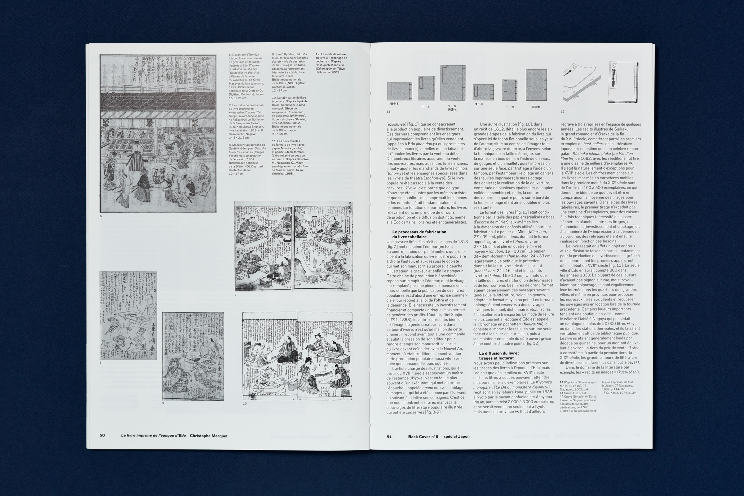
Le livre imprimé de l’époque d’Edo : l’âge d’or de l’édition japonaise
par Christophe Marquet
Durant la période Edo (XVIIe – XIXe siècle), l’organisation industrielle et sociale de l’édition était très développée, florissante et les techniques de distribution poussées et efficaces. Les éditeurs y avaient une place de choix et la propriété des plaques de bois nécessaires à l’impression des estampes était indispensable pour tenir son rang. Retour sur un moment clé de l’histoire de l’édition au Japon.
Koga Hirano : vie et œuvre
par Kiyonori Muroga
Figure marquante et singulière dans la typographie contemporaine au Japon, Koga Hirano est un personnage engagé. Ses compositions typographiques sont uniques et déstructurées. Portrait.
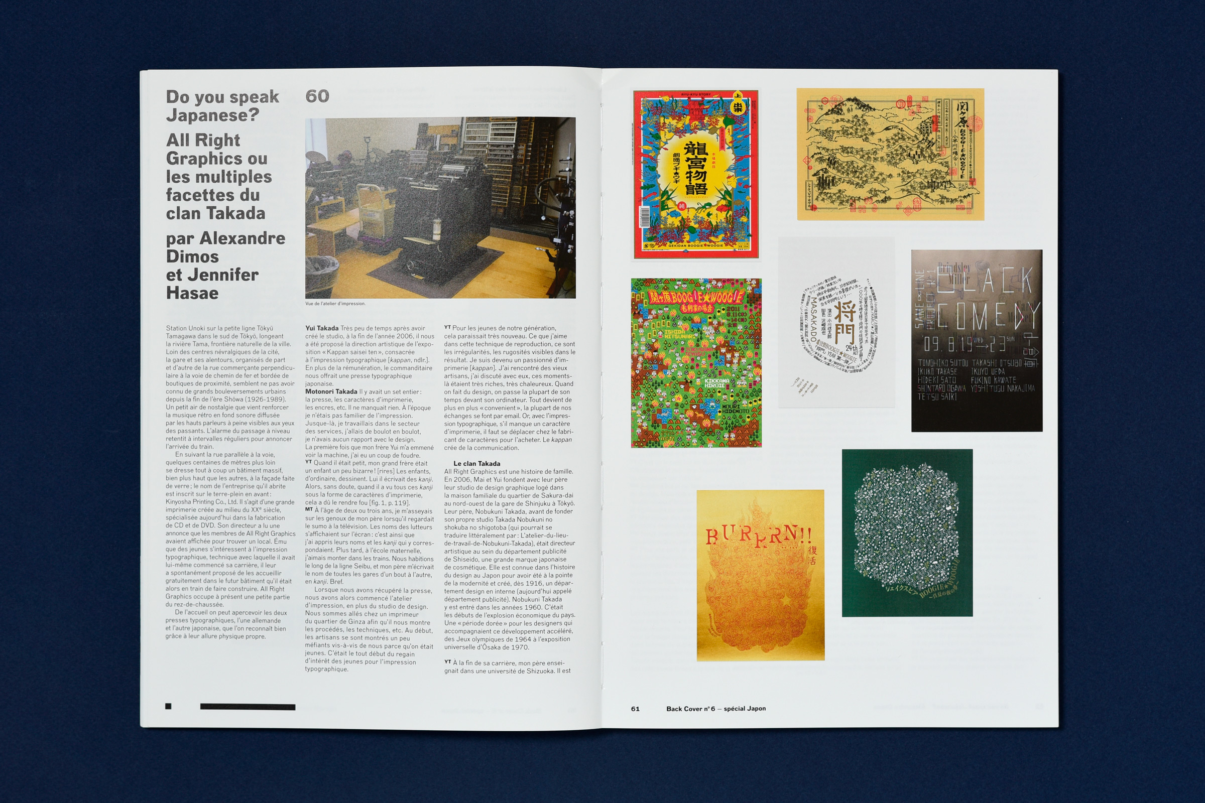
Do you speak Japanese ? All Right Graphics ou les multiples facettes du clan Takada
par Jennifer Hasae & Alexandre Dimos
Entretien avec Satoshi Kondo et Takahiro Ichino
par Mariko Yokogi
Tōkyō concentre toutes les attentions dans les domaines de la création. Mais plus à l’est, Osaka, un autre monstre urbain offre ses propres singularités. Entretien croisé entre deux jeunes designers graphiques du Kansai.
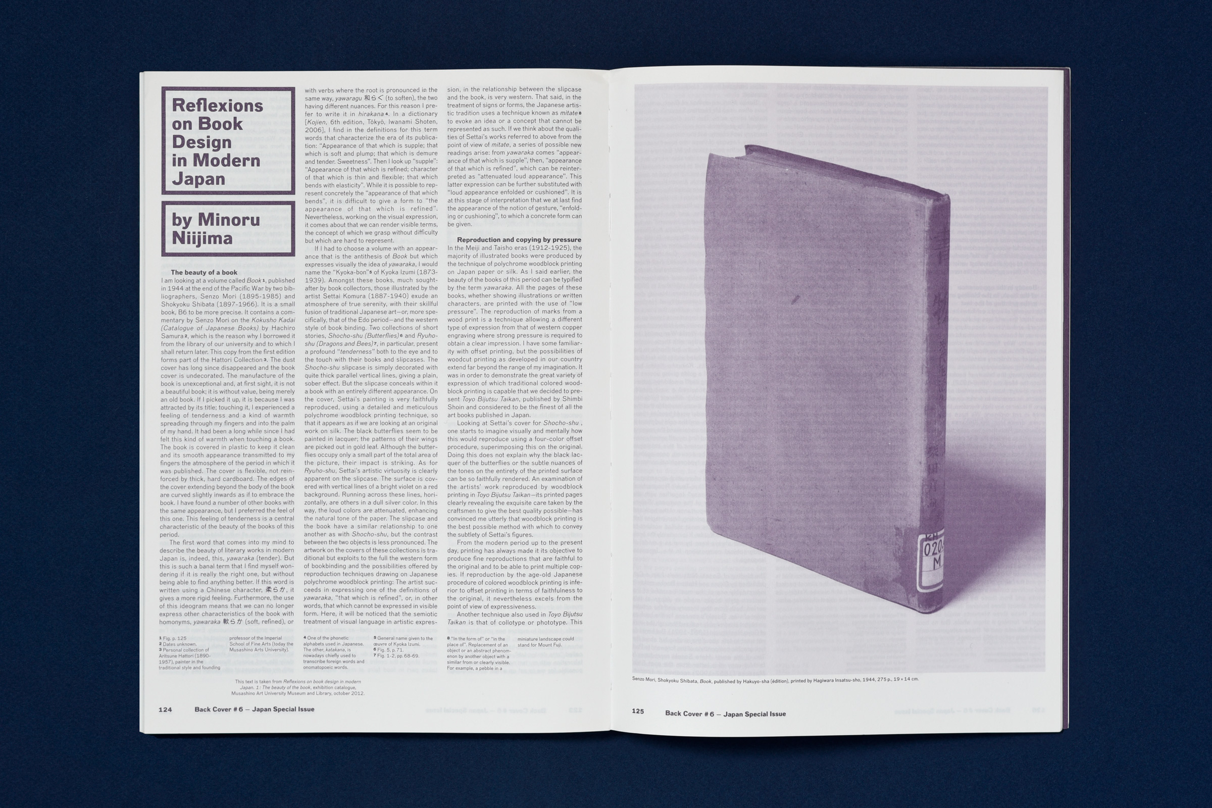
Réflexions sur le « book design » au Japon moderne
par Niijima Minoru
Minoru Niijima explore la collection d’ouvrages des années 1920 de la bibliothèque de l’université de Musashino.
Norakuro dans l’histoire de la bande dessinée japonaise
par Isao Shimizu
Œuvre majeure de Tagawa Suihō, la série de mangas Norakuro débute en 1931 et se poursuit durant dix ans dans les pages de la revue Shōnen Club. Énorme best-seller, Norakuro est de loin le plus populaire des mangas des années 1930 – et au-delà. L’immense popularité de Norakuro tient au fait qu’il s’agit du premier long récit japonais en bande dessinée avec pour personnage principal, Norakuro, un chien soldat, dont les multiples épisodes dépeignent les réussites et promotions… Cependant Norakuro ne saurait être réduit à son seul statut de manga à succès. Son style d’expression a été l’instigateur d’une réforme profonde.